Directory

Showing posts with label HCD. Show all posts

Wednesday, September 19, 2012

VIJAY poster process update

Updating on the process for Vijay's Jazz series in the Folly Theater Kansas City, MO. Starting from my early draft i ran into the issues of how the keys are interacting with the piano, so developing the keys was key to my work. originally I had masked off actual keys and worked in that area, but I personally had wanted to make it more less cheep looking or ugly, laughing out loud, so I moved to a fully penned out type that I had more control with.


The original was a nice draft to get the ideas I wanted down, working from there was important to start critically working on it. Started to look at the typography more in-depth.


So I re did the keys completely and started to think about the drips more and introducing more of a concise flow of the drips with more meaning. 


After changing colors, type layout I went through and re-edited my keys. I found issues with the A and the J gave me a hell of a time so I was directed to manage those and try to actually represent keys of a piano appropriately.


Since I wanted to make the keys more accurate to a real piano such as how the black keys are laid out and so I made a skeleton to produce the funky angles I want without loosing some grid. 


So I had to work on the clarity of the Type of the letters A, J, and V so I focused on them and making the overall keys more cohesive and i started to make the work more developed, I have gotten to the point where the comb is being used to make things as good as they can be.


Wednesday, September 5, 2012

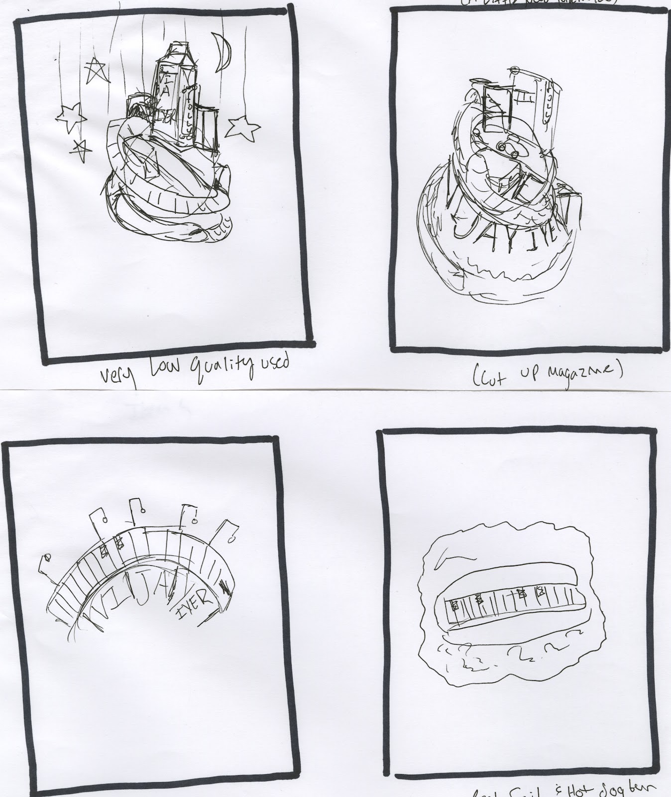
Vijay//Idea//sketches


Each sketch either has some notation of how I am incorporating my idea of breaking vector by using different formats such as photography, cutouts, paint, etc. 

Thursday, August 30, 2012

Feelings//Textiles//Folly Poster


Carbon Fiber

the reason i find this appropriate is that it is raw in form, however raw it is, the qualities of CF are refined, light but build of it is ever energetic and moving (fiber) it flexes it bends. I feel like that is something that meets a certain mood I want to explore within my poster.


Aluminum

Aluminum is a compressed very refined product yet it still is raw in form and also carries a detail that i feel is appropriate to being raw, gritty, detailed, manifested, elemental. All these things are why I believe it would contribute well to my poster being it has these qualities. 


The last two images are of textures of the feeling overwhelming or energetic. The picture of the goose bumps really is something that is creating a lot of emotions known to humans a general feeling of succumbing to something that is manifested within an overwhelming sense, elemental, raw feelings. The tile is busy, gritty, detailed, overwhelming. i feel as thought out as it is it is still raw and could be formed to be more. These qualities i feel are depicted through Vijay's music.