Directory

Showing posts with label IA. Show all posts

Friday, April 26, 2013

iphone wireframes // response

FIESTA APP wireframes


The movement within mobile devices is quite rapid. Understanding of finger gestures has pushed the format to be easier and more accessible for a wider audience. I understand that really if an app isnt built so that someone can only use one had that it really effects the usage of the app. It is interesting that people are so used to being able to just use one hand when really generationally we have been using both hands for the same purposes. I look at using my computer today, i type with both hands and play games with both hands, but then i think well i do write with one hand and we use one hand on the phone, changing the channels on tv, there are tons of things we just are so instinctual to do that may or may not call for both hands. I also find it interesting the finger gestures that we have been employing upon the mobile format.

Fingers are one of the things that put us on the evolutionary top, so it is natural to employ solutions to such a small format by using finger based responses to the problem. I figure that it took some time to figure out that people like the ease of just using one hand. I can see making it a standard to use both hands could complicate the finger system also. there would have to be a lot more responsive coding for it to work appropriately. When i was reading about the differences between formats for web i was reading a "versus" or comparison graph comparing mobile/hybrid/responsive/native sites. It was talking about how Mobile sites or apps have been so openly excepted being that they have redefined responsive design. They on average are just easier, cost effective, responsive, personal, and function in a way that people are more open to using them. The old days of having to use basic sites has faded because over complicated or un exciting formats have been out-shined by the pretty little package the iphone (or mobile in general) has brought to the table. 


Friday, March 15, 2013

building information // a self assessment

It is hard to really evaluate my opinion on my performance to date within IA, not because I feel like I'm behind or have been not been working hard. I think it is hard for me to evaluate myself because I feel that i am doing well. I believe that my first project within the class, building the NYT site mockup, showed some understanding of controlling information and concessively making interactive formal design. I have taken this class serious i believe my work has shown such. Since the wireframes i have tried to be as clear as possible, in addition trying to understand how a user navigates and would use the site. (See the images below)


The presentation of our websites i showed an understanding of what the site was trying to achieve within the site, people responded positively. The affirmation that people saw how the site was organizing a ton of information in a clear way in addition response was that it was using a nice sense of whitespace which helps the viewer taking in such a dense information packed site. There were things i can work on within the site, but that is just how things work. new thoughts are always appreciated--and that is something i have been really to work on. Being open to input is difficult at times but i am giving anything a chance. Overall so far i think with my input in crits and just my own work quality to date i would think im doing pretty good. This however doesnt mean I will slack off and not be pushing myself to do more, because i will be for the rest of the semester, especially when working on the collection website right now i do not want to come up short within my design and userbility (bushism for user ability to interact with) Now time for spring break!

Monday, March 4, 2013

Evaluating myself

It is hard to believe that we are 5 weeks in and time has just blew by. So far I actually have really enjoyed my time. I have tried lots of new things, exploring my horizons in type, letting myself just try new ideas and not making the first thing that comes into my head. For my User experience class i have tried to do new things, with the How To video Ian and I both really wanted to try new things, I threw out the idea to try trip-tic and I also story boarded out the way we could employ the special videography. So I feel that Ive been trying new things and that is good I believe. I want to continue to push new ideas for the remainder of the semester and into my work outside of school. Im happy with how I've been trying to push.  Do I think I'm doing the best, no but I have really been trying. I think ive been growing consistently, and its only been five weeks!!!

Tuesday, February 26, 2013

Online Site Mock-up (NYT)

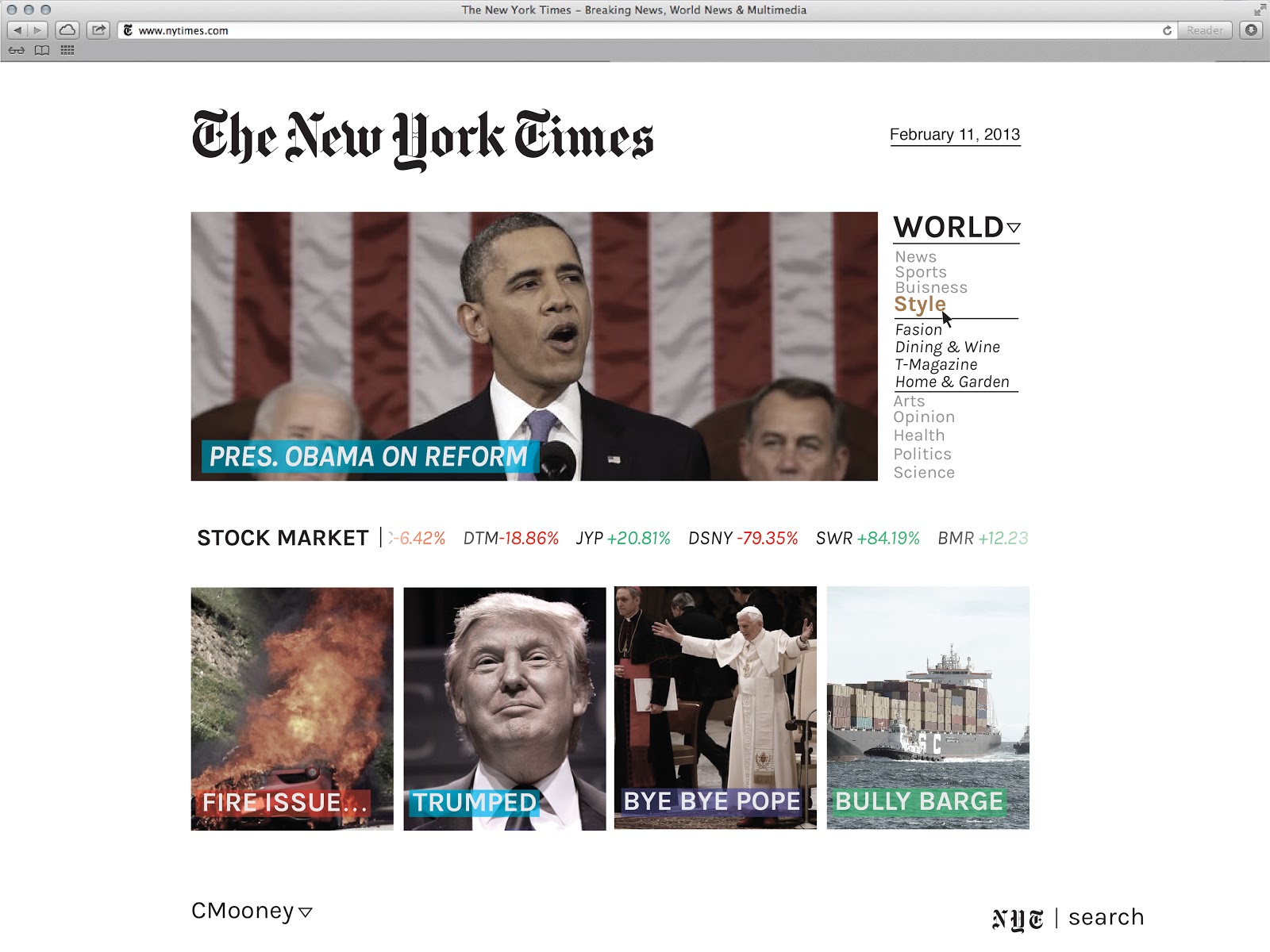
Here is my newly redesigned New York Times Mock up. My Ideas for the site was to completely simplify and minimize all the noise that NYT has all over their site. The idea was to create module boxes that continually change featuring each section of articles within the news. Each color box under the article name is the color coded category identifier. This helps their lack of color on their previous website and also adds to the constructed organization I am working to create.


(left) images show how the images change over time and (right) shows how when you roll over an article the title and a small summary of the article appears. In Addition I made a profile option that allows the average NYT reader to have another level of interaction. Favoriting articles, authors, categories, communicating with other readers, employers, etc. 


The profile allows you to stay connected to the authors you like and the subjects you read. You also have the ability to see stats on how diverse your pallet is when reading on the NYT website. This also allows you to have others to see what you find most important or what you think is interesting. 


You also would have the option to set your information to private allowing you to just have a singular personal relationship with NYT. In addition people just sometimes want that option.


 Bringing it back to the organization I am trying to achieve can be shown through my hover state hierarchy using the color change and also the category choice bolds to clarify to the user what topic they over. Then I break down the steps you would take to view an article and see the authors own profile page.


Once you have seen the topic you you want to investigate. Such as the Dining & Wine Section within the Style category. 


Once you found an interesting article you can select it and read the article and also have the options to rate it and also follow the author, etc. 


Found an interesting article and want to learn more about the author? With the profile and options to rate them you can follow what they write and you can also rate them which will save to your favorites creating a more specific relationship between you and the NYT site. 


Overall the site is meant to limit the information being blasted in the viewers, but all the information is still viewable. Making the information organized and leaving them on a single faced page with the images scrolling also brings the site to a more "web" design. Since the NYT is so modeled off the actual paper it is nice to have a different visual style.