

- what is the primary mode of appeal?
- what is the meaning embedded in the design? is it clear?
- how refined and professional is the imagery, type, hierarchy, composition, and color?
- how cohesive is the system?
- how well does this work consider the dimensionality of the product?
- what is the level of physical craft on the products? digital craft of the photos?
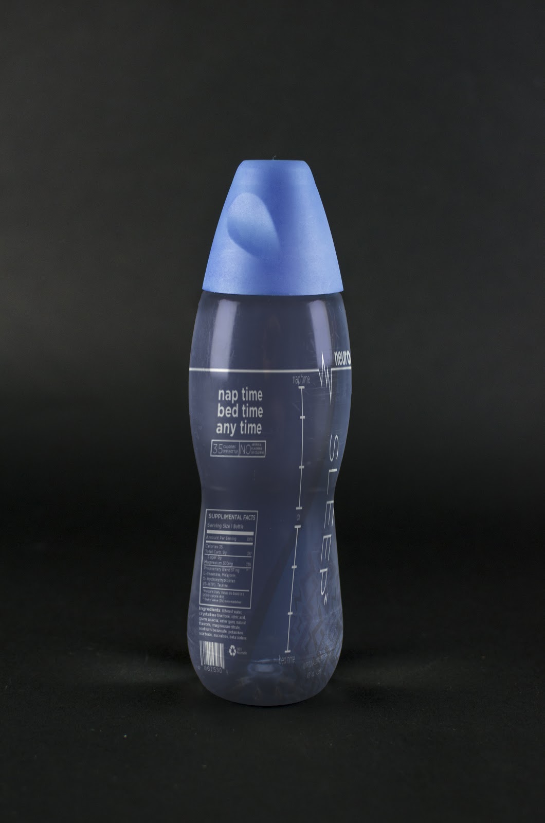
First my mode of appeal was a mixture of Ethos and Pathos. The original was Logos driven so I moved them towards Ethos then added bits of imagery to give it a little more impact with the pathos assets.The imagery of the +'s the Z's and *'s are all emotional ties to the actions the bottle will endues. The meaning is hopefullly embedded correctly and the colors should match the emotional appeal for each bottle. Sleep being a dark blue, bliss the happy yellow, and sonic which is a focused red target. Each is supposed to focus on the specific flavor. Then as a group they are supposed to reflect one another. I tried to make the actual bottle but it did not work so I had to opt for a good rendering. Each have the body reflective bottle style where it is trim in the center, which the brand is trying to sell healthy drinks. The bottles are Beautiful and i think it not smart to mess with them compositionally. I am happy with each bottle and i feel as if they do reach my goals. This was a fun project and i am proud of my designs. They are in my opinion better than the original designed bottles. They have more to them and i feel that people, and the people that i talked to would want them more than the originals.


- What is the primary mode of appeal?
ReplyDeletePathos.
- What is the meaning embedded in the design? Is it clear?
The imagery in the background clearly relate to the drink's purpose. For example, the Z's for the sleep drink.
- How refined and professional is the imagery, type, hierarchy, composition, and color?
Image and type all work nicely. I like how you used the symbol in the name/background. Hierarchy and composition is in clear order. Color is conceptually clear.
- How cohesive is the system?
Very cohesive. I see it all as one brand system.
- How well does this work consider the dimensionality of the product?
Good. I like how the line of the Neuro logo wraps around.
- What is the level of physical craft on the products? Digital craft of the photos?
Nicely executed photoshop. The bottles look like their leaning a little to the right though. The last context shot isn't working for me at all.
The primary mode is leaning more towards pathos. The meaning embedded is the "levels" of the product that the consumer can (or is about to) experience. The levels ranges from light, moderate, and heavy. The type design for sonic, bliss, and sleep is nice. Little visual elements incorporated with the type (the moments with the "i") works well. The typeface for sonic feels that it needs more work, maybe a more sharp and edgy typeface? Layout and neuro is kept consistence for easy recognition. Different colors for different type has a consistant color palette. I feel that the message is clear. Great job on photoshop.
ReplyDelete