
Showing posts with label Type1. Show all posts
Showing posts with label Type1. Show all posts
Friday, December 9, 2011
Type Final Thoughts.
My final weeks of Type had been very interesting. The classes were very constructive, I believe i did the my best work in the last weeks of class. I feel like i have really grown in the class. I am proud of my work of late, even my 3d letterforms, even though they came out not as pretty as they should have, i spent over 14 hours on them, while being sick and sacrificed studying for a test just to get them done. I feel like I really have shown how dedicated I am and I found that dedication while working in Type 1. One semester down many more to go.

Thursday, December 8, 2011
Final Edition of History Timeline
Finally finished my Timeline, after many hours of working on this fold out book I have come up with something i am extremely proud of. After working constantly and over thanksgiving the work seemingly proved beneficial. The clean timeline that depicts imagery from mostly WWII with the American Flag present representing how the flag has been Iconosized through war photography.


overall i am very pleased with the book, it was a very interesting project. Over time I think i will be adding more to this book and make an actual piece of work for myself.
Sunday, November 27, 2011
Timeline update
I managed to work on the timeline over thanksgiving break, i have all the timeline spreads done also i started on the cover pages. I will take some screen shots tomorrow when i have some time. I changed some of the ways i presented the timeline images and i organized all the text differently.
pictures soon.
pictures soon.
Sunday, November 20, 2011
Friday, November 18, 2011


Tuesday, November 8, 2011
3D type Final
These are some of the final shots of the finished type project in its environment.
With finally choosing the word "choice" for this project, we we wanted to give the message that people make a choice and have a choice in life and that it should be considered before doing any drastic action. We placed the text on an overpass on a main street. Upon making the letter we learned some better ways to display the letters, make the letters and further learned the importance of time management. Some ways to better the final product would have been some light testing and further experimentation with different light sources in different areas. Also some better camera usage would have helped with the images.


Wednesday, October 26, 2011
Type Constructing Letter Forms


Our word is CHOICE, it is supposed to be a form that when placed will bring light to the sad fact people commit suicide and that people that have could have gotten help if only given the support needed, the work will display information on how to find ways of getting away from the thought of suicide.
the letters are 11x20 and are Universe Bold Condensed.
Tuesday, October 18, 2011
Choice
Our latest type assignment is a 3d letter form that expresses a idea, form, or the word itself. My word is Choice and it is concerning the awareness of people who sadly commit suicide.
we are going to build it on a bridge where it would present a place where many people decide to give up their lives.
here are some shots of possible bridges where we would like to install it.


we are going to build it on a bridge where it would present a place where many people decide to give up their lives.
here are some shots of possible bridges where we would like to install it.


Friday, October 14, 2011


Wednesday, October 5, 2011
interesting points about the flag #2
Most people over look the rules on the flag, it is something that people totally ignore in todays culture. Rules such as you cannot wear the flag and people wear the flag in some form all the time. In researching the flag i found many ways people today totally disregard the laws concerning the flag. It is also interesting how people manipulate the law being that it is sorta a grandfather clause and that the law doesnt apply to todays society. I can understand the want to be patriotic and to represent the flag in a positive way but know people are wearing the flag in a form of disrespect. In addition to the fact that the rules are not even enforced is presenting another contradiction to the idea of law and order. When laws are set you would assume they would be enforced so the lack of enforcement is very interesting. However just the fact that there are so many rules that people do not know and just ignore is very interesting to the idea of the flag.
law
rule
respect
enforcement
dictate
fair
patriotism
grandfather clause
loophole
evasion
disregard
code
Respect/disrespect
enforcement, regulate
disregard, ignore
rule,law,code
manipulate, evasion
law
rule
respect
enforcement
dictate
fair
patriotism
grandfather clause
manipulate
systemloophole
evasion
disregard
code
Respect/disrespect
enforcement, regulate
disregard, ignore
rule,law,code
manipulate, evasion
the interesting things about the american flag #1
The American flag can represent many things, it has to being it represents a whole nation, and so the nation represents the flag. The biggest problem about flags is that they represent everything that happens in the nation. Even though the flag is there to represent the idea of freedom of America, the consistent wars and military disobedience can cause people to have bad views about the nation. The aid and protection the military presents is great but the bad apples of the groups easily contradict the whole meaning behind the flag. causes people to burn the flag in hate because of something that had happened to them or to somebody they know. Its sad to see how easy it is for the flag to be represented in a whole well by the military but at the same time so distorted by it at the same time. It is a true catch 22 with the military representing the flag, as much good they do in the world they will always be viewed by some people as a bad group of people.
Being that the American flag represents all entities who live and represent America it is easy to view it as a symbol of empiricism. The military really adds to the viewing of America, being that it is always in war and has soldiers in practically every nation the views on America can be pointed or associated directly to the military. Even though the soldiers may be helping what ever nation they are in, such as helping building communities, protection, economic stimulation, and just all around Aid when bad things happen. A sad fact though and a big attribute to the reason why the flag can be poorly represented by the military is that sometimes there are bad apples that do bad things that make some peoples attitudes for the america and the symbol of the america, the flag a distasteful one. One that sometimes leads to Flag burning, obscuring, recreation that represents it in a bad way, and other forms of disrespectful acts. It is sad that the military is such a catch 22 for the flag, since they do so much good but the bad completely out weighs the good.
war,
empire,
rule,
terrorism,
good,
bad,
distort,
reflect,
death,
disobedience,
hate,
flag burning,
aid,
protection,
help,
construction,
catch 22,
distastful, obscuring,
Monday, October 3, 2011
Hel' Vet' Ica'
I love the movie Helvetica, David Overholt introduced it to me last year in his foundation class. Ever since i have been so in love with the darn movie. The music is just fantastic and the interviews are all just so well done. My favorite artist is in the movie also, David Carson, so the movie just calls my name. I think Helvetica is a movie every art or graphic design oriented person should see. It is beautiful and it brings attention to one of those fonts that people seem to just disregard. Im glad we got to watch it in class.
Friday, September 23, 2011


Wednesday, September 21, 2011
Type1 Quotes
"If you can't explain it simply you don't understand it well enough."– Albert Einstein
(March 14, 1879 – April 18, 1955)
Albert Einstein is one of the most influential men on the Earth. His work in science and as an inventor is amazing, this quote could apply to many subjects but i think it especially applies to Graphic design. Simply put his quote is one of those statements that could answer all the questions of life for a graphic designer. If a graphic designer cant explain something well enough that designer simply put doesn't understand their subject well enough.
"Everything is designed. Few things are designed well!"– Brian Reed
(March 21, 1912)
This is a basic idea for graphic designers, i believe it doesn't always take true dedication and heart, although those will make it good, it takes luck and a good sense of what appropriately fits the topic. Brian Reed made one of the best comments about graphic design with this quote none the less. I think designed well is different than being a great designer. I believe one will have many great designs in there life, but i dont necessarily believe that will make them a great designer. I just takes a good understanding of subject, media, and culture.
"Designing a product is designing a relationship."
Thomas J Watson Jr (January 14, 1914 - December 31)
Networking is a must in most forms of work. You must have relationships (friendships/etc) to keep in touch with people.I believe this quote is one of the stronger being that it is so true to form for graphic design. To truly make something of worth for somebody you first must know them, have a relationship in some form with the person. it is important to have that connection with a client, boss, etc. to do well in this world.
Friday, September 16, 2011
Type Letter forms


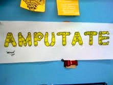

My final product for Type 1 for Letter form is my type called "Filangees". it was inspired by Finger on dafont, but I wanted to take a more illustrative approach. If i were able to bring it into illustrator I think the line work and details could be more perfected, but in my opinion the fingers have a certain style with them being so "hand done". I really liked this project, hopefully i can revisit it for fun soon.
Wednesday, September 7, 2011
Type1 project 2 blogspot thumbnails (and progress work)
Since my new best friend has been the bathroom, I asked my roommate to politely ask my teachers if i could post up my work on blogspot since i was incapable of going to class today.
So i started with some simple color theory studies and i was looking at colors that would go well together, so i took some shots of the site while i was using it.


then i started my thumbnail designs, i originally had four designs but my first two ended up being mashed together.


So i started with some simple color theory studies and i was looking at colors that would go well together, so i took some shots of the site while i was using it.


then i started my thumbnail designs, i originally had four designs but my first two ended up being mashed together.


on my last two blogs i decided to write reasons why i think they would be appropriate and how they could represent my ideas. For each one i made a color key that had the colors i would use on the blog. After i made them i chose my 3rd design as the one to stay up, and i wrote the HEX color codes on the sketch.


Tuesday, September 6, 2011
Graphic Designer, why do i want to be one?
Design and art in general has been apart of my life since I was young. I believe it first started with my Papa who was a VP of Marketing at Lowerance (what used to be the largest GPS company until he retired) and over 30 years of marketing experience both on a graphic and photographic basis, his influences in my life that occurred from a young age and over the time I spent with my grandparents when my mother had Cancer, i believe it had a direct influence on my love for design. When my Mother eventually lived through her cancer she ended up at a Marketing firm where I met some of my good friends who were in the creative department. My friend Tom Piland who is the art director over the firm my mother work for is a good friend who has always been there when I had questions which has really proved to me how the culture and general society of Graphic artist is very inviting. As i began to get into the car culture i started to feel like they may be lacking in certain elements, one of which was Graphic design, i believe that they have a simple outlook on the idea of design. Tom and i have conversed a plethora of times and I have expressed my want to go into a Magazine firm for cars (my other love) and introduce a better representation of Design for the Automotive world.
My original memories of deciding Graphic design could be a really cool was when i would sit in on graphic designers at my Papa's place of work. I credit him for a lot of my desire for wanting to become a graphic designer, eventually I want to become a Art director, but there isn't a better way to start my journey to that goal than starting as a Graphic Designer.
Monday, September 5, 2011
UPDATE V3
UPDATE V3
new blogger look, its okay, doesnt look horrible. The colors go well. im not sure how i feel about it.


Subscribe to:
Posts (Atom)